


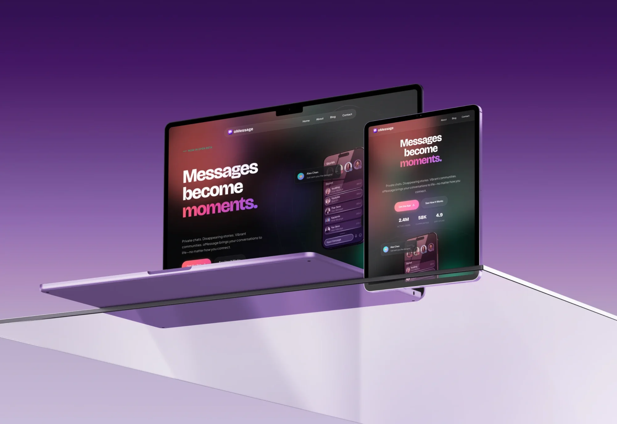
oMessage Landing Page
The Challenge
oMessage was preparing to launch a mobile app and needed a landing page that doesn’t just inform, it converts. In a crowded app market, the first impression needed to convince instantly and drive visitors to download.
The Solution
I designed and developed a high-conversion landing page with a modern dark-mode aesthetic and glassmorphism effects that seamlessly translate the app’s visual identity to the web.
Technical Implementation
- Frontend: Custom WordPress theme built with PHP and SCSS, using design tokens for consistent styling and rapid iteration.
- Build System: Vite bundler with hash-based asset versioning to ensure optimal performance and cache-busting on deploy.
- Animations: GSAP with ScrollTrigger for scroll-triggered microinteractions and section reveals, plus Lenis for buttery-smooth, inertia-based scrolling.
- Components:
- Custom overlay scrollbar that matches the dark UI and enhances perceived polish.
- FAQ accordion for compact, accessible content organization.
- Infinite-scroll testimonials to surface continuous social proof without overwhelming the layout.
Design Highlights
- Glassmorphism Effects: Translucent, blurred panels and cards that create depth, hierarchy, and a modern, app-like feel.
- Animated Feature Showcases: Interactive, scroll-activated sections that spotlight key app features and guide the user narrative.
- Social Proof: Prominent TechCrunch and Forbes mentions to establish trust and credibility within seconds.
- 6 Breakpoints: Pixel-perfect optimization across six responsive breakpoints, ensuring a tailored experience from small phones to large desktops.
The Result
The final landing page powerfully supports the app launch. The interplay of dark-mode aesthetics, fluid animations, and strategically placed download CTAs creates a focused, high-conversion experience that turns visitors into users.